
The seismic traces may be displayed in a variety of ways. For interpretation the data are normally loaded onto an interpretation workstation so the data can be displayed by the interpreter in any form or scale. The drawback of this is that it is easy to lose sight of the big picture. It is also sometimes hard on the screen to compare different processing parameters with any accuracy. A hardcopy display should therefore be produced for many processing tests and final products. Seismic processing is very unkind to trees. Whether data are displayed on screen or hardcopy it is essential that the user understands how the software has scaled the traces for display. Display scaling may be in addition to any scaling specified in the processing sequence.
A typical plotting device suitable for seismic data would be a 400 dots per inch electrostatic ("versatec") plotter or a thermal plotter of similar resolution. A continuous 18" paper role is sufficient for most seismic applications.
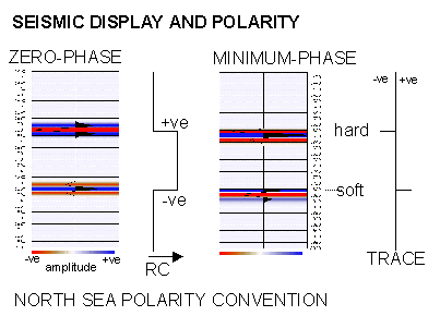
The only polarity standard used is that defined by the SEG and it is ambiguous and confusing since it defines a different standard for minimum and zero-phase data. Here we define two areas of polarity definition, one for seismic recording and one for seismic display.
The use of terms NORMAL and REVERSE POLARITY should be avoided at all costs. Unfortunately these are the terms in common usage. Any seismic display program should display a positive number as a peak and a negative number as a trough (as shown in the adjacent figure). Most programs will also allow the display polarity to be reversed which also allows for further confusion unless the polarity or colourbar is clearly annotated on the display. Historically in the North Sea for zero-phase data a hard event or impedance increase, such as the top chalk, is represented as a trough. The opposite polarity convention is used in the USA. By the SEG standards defined for a zero-phase wavelet the North Sea convention is reverse standard polarity.
The best composite definition for the North Sea is something like "positive reflection coefficient is represented by a negative number on tape and as a white trough in display".
Contractors use further confusing nomenclature to define polarity on sidelabels, EBCDIC headers and in processing reports. A particularly useful evasive phrase is "the acquisition polarity was maintained throughout processing". This should always be the case since few processing routines will change the polarity of seismic data - however many processing routines can change the phase (note a 180o phase shift is equivalent to a polarity reversal). In determining the phase and polarity of the seismic data the interpreter must add up the effects of all processes through acquisition and processing which may effect the final phase and polarity. This is often difficult since some processes may change the phase of the data without stating that they have done so. An example of the latter is the GSI (or HGS) DESIG process which by default converts a source signature to it's zero-phase equivalent rather than the conventional minimum phase equivalent.
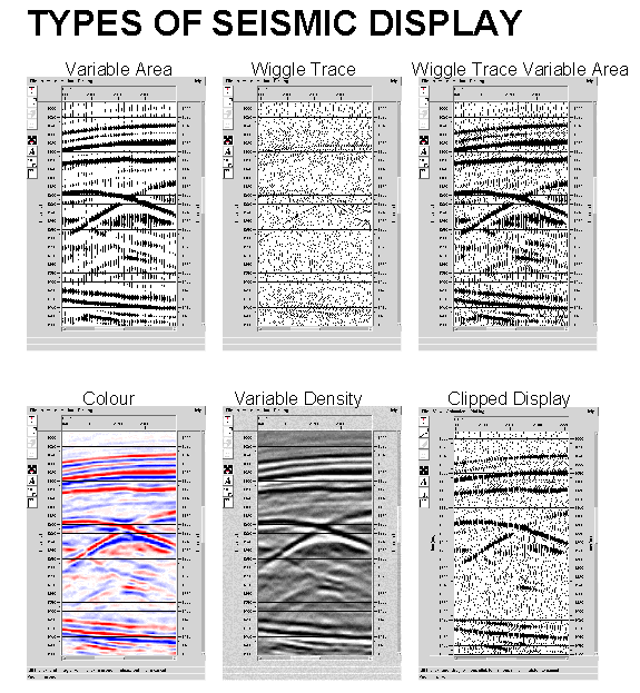
The previous adjacent figure shows the principal modes of plotting seismic data. The variable area with wiggle display is most commonly used for seismic processing purposes, the colour display is mostly used for interpretation. For hardcopy, the wiggle and fill are plotted as a series of small dots at less than 0.1mm spacing. It is common to fill in the positive part of the wiggle curve.
For following table summarises typical display scales used in the North Sea. The horizontal scales in traces per cm assume a CMP spacing of 12.5m.
|
Vertical |
Horizontal |
Scale |
Description |
|
5cm/s |
40tpc |
1:50000 |
Squash |
|
10cm/s |
20tpc |
1:25000 |
Normal |
|
20cm/s |
10tpc |
1:12500 |
Enlarged |
On a conventional 400dpi plotter the squash plot would appear too dark and usually only alternate traces would be plotted.
The plotting software will usually read in a default number of traces (e.g. 500) and determine the average amplitude. The rest of the plot will be scaled relative to this amplitude such that the display is visible. The user can usually control the number of traces and the scaling window (for example to avoid very high or low amplitudes within the default scaling window).
The bias can be used to alter the zero-amplitude baseline. An addition of bias (as a percentage of trace spacing) reduces the amount of black infill, making the display greyer in appearance.
The gain level of the display should be selected such that reflections of interest overlap to form continuous events. Hopefully random noise will not overlap and will therefore appear discontinuous. The gain is usually specified in decibels relative to the calculated average amplitudes. Typically the 0dB level is set so the average amplitude is 1/2 trace spacing, so +3dB would ensure the average was 1 trace spacing and ensure overlap. Very high amplitudes will usually be clipped at 4 traces excursions.